-
The Relationship between Democracy and Climate Change Policy
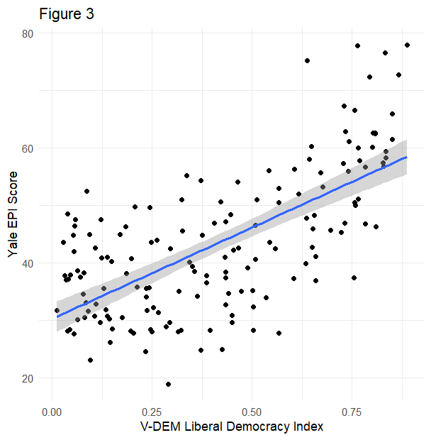
Introduction The 2023 State of the Global Climate Report from the World Meteorological Organization confirmed what many people around the world knew to be the case—climate change is here, and it is only getting worse. Not only was 2023 the hottest year on record, but the planet also broke unsettling records for ocean temperature, sea…
-
The Obesity Epidemic Part 4: Incretin Mimetics and the End of Obesity
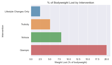
1313 words – 7 minute read Hey! Happy Sunday. This week marks the end of my four-part series on the Obesity epidemic in the developed world. In week one, I wrote about the scale of the crisis – over 42% of Americans are currently obese (BMI of 30 or higher); in week two, I wrote…
-
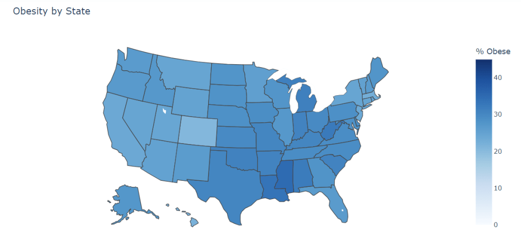
The Obesity Epidemic Part 3: Obesity is a Class Issue

Hey – happy Sunday! This is the penultimate installment in my series on obesity. For a review of what we have covered so far, please see the previous two posts. The data for this week were yet again sourced from the CDC BRFSS. As I said in the title of this post, obesity is a…
-
The Obesity Epidemic Part 2: The Causes of the Crises

Hey – happy Sunday! This is part 2 of my series on the obesity epidemic in the United States and other developed nations. For an introduction to the topic at hand, click here. The data for this week’s graphs were sourced from the CDC BRFSS, the USDA and the World Bank. What causes obesity at…
-
The Obesity Epidemic Part 1: Obesity is a Public Health Crisis
Hey – happy Sunday! This week is the start of a 4-part series on the obesity epidemic in the United States. Part 1 (today) will function as an introduction to the topic and an explanation of why I believe our metabolic health crisis cannot be solved at the individual level; part 2 will delve into…
-
NOMINATE Application Deep Dive
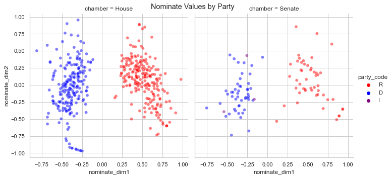
If you are a reader of data journalism, it’s likely you’ve seen partisan scores quantified; odds are, those partisan scores were generated with DW-Nominate. DW-Nominate comes from the NOMINATE family of multidimensional scaling applications, developed by Keith T. Poole and Howard Rosenthal in the 1980s. NOMINATE applications use roll call voting data (or the individual…
-
The Math Behind Why Congress Just Can’t Seem to Get Along
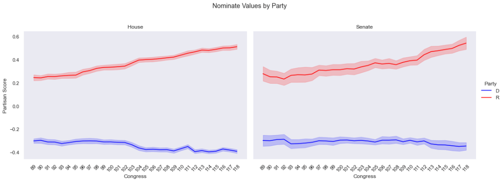
Happy Father’s Day! Dads are awesome and it’s great to have a day dedicated to celebrating them. To my dad, thanks for being my role model (sorry for always kicking your butt at tennis). To the rest of the dads out there, live it up today and make sure you tell some cheesy jokes for…
-
How did the world respond to COVID-19?
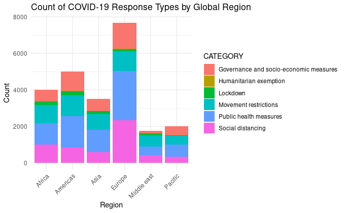
Hey – happy Sunday! While I know this newsletter has mainly focused on politics for the first two months, I want to fill you in on a little change, dear reader: I will not continue writing exclusively about political data. I plan to explore some of my other interests outside of politics in this newsletter.…
-
Polarization in Congress: The Importance of Math to Politics
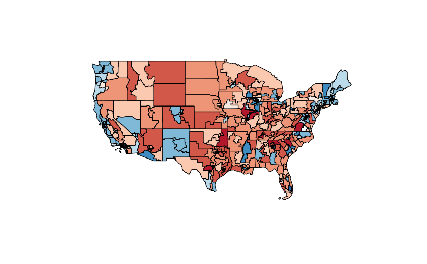
This week, we are going to focus more on data than on politics. We will examine how math can be used to better understand human social dynamics, and by the end of this newsletter, I hope to have you thinking more like a social scientist. For this Sunday’s graph, I have made a map of…
-
How not to make a graph: a lesson in data storytelling

Happy Sunday! Last week marked the end of my Undergraduate Research Fellowship with Dr. John Kuk in the University of Oklahoma Political Science Department. His political data analysis class introduced me to my love of data, and my work with him for the last calendar year has turbo-charged my math and coding skills. While our…
Data Driven Politics
Seek Truth, Not Comfort
