
Happy Father’s Day! Dads are awesome and it’s great to have a day dedicated to celebrating them. To my dad, thanks for being my role model (sorry for always kicking your butt at tennis). To the rest of the dads out there, live it up today and make sure you tell some cheesy jokes for me. To all the sons and daughters reading this, give your dad a call today – he would appreciate it. With that said, let’s get into it!
This week’s post is a follow-up on the one from two weeks ago about polarization in our current Congress. This time, I’d like to take a look at congressional polarization over time.
I think this week’s graph is really cool. I’ve switched from using ggplot in R to using Seaborn in Python (a much more powerful graphics program) so get ready for some awesome graphs coming up soon! My graph is totally inspired from this one by Pew Research in 2020. See my version below:
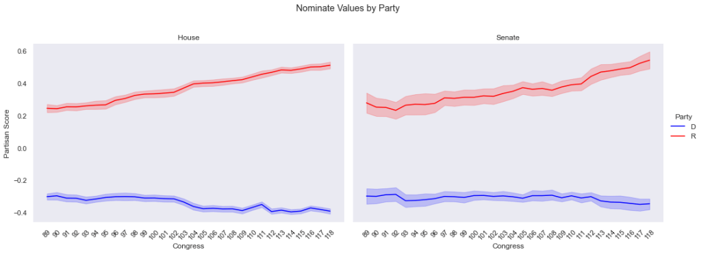
As can be seen here, Congress has gotten more polarized in recent years, with Republicans moving further from the center than Democrats. This fully makes sense to me, because while Democrats have certainly gotten more liberal, Republicans have undeniably gone off the deep end of conservatism.
In addition to just the mean partisan score my graph improves on the methodology of the Pew Research graph by showing the confidence intervals. Basically, the faded area just above and below each line shows where 95% of all observed partisan scores lie relative to the mean. So, as you can see, there is more intra-chamber polarization in the Senate than in the House.
One important takeaway from this graph is when polarization really started to kick up a notch – the 111th Congress. This was the session from 2009-2010 (the beginning of the Obama era) and is cited by political scientists as a turning point in modern politics. My theories as to why 2008 was such a big turning point was, of course, the election of Obama (which led to a spike of racial resentment), the spread of Facebook and increased use of technology in our elections, and the chaos of the GFC (the 2008 financial crisis). All of these events caused increased polarization which has only accelerated in recent years.
A little foreshadowing here, but I’m working on a big, very wonky deep dive into one of my favorite statistical methods (NOMINATE – the partisan scores seen on the map from two weeks ago and the line graph today). Subscribe to get the nerdiness sent straight to your inbox.
Thanks for reading. Best wishes and have a great week.

Leave a comment