
This week, we are going to focus more on data than on politics. We will examine how math can be used to better understand human social dynamics, and by the end of this newsletter, I hope to have you thinking more like a social scientist.
For this Sunday’s graph, I have made a map of congressional polarization. See below:
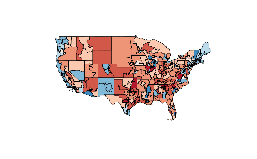
Here, you can see that most of the middle of the country is red while most of the costs are blue. This shouldn’t be surprising to anyone who’s paying attention to politics at all, but it’s so important to back up your assumptions with hard data. More on that later.
This map shows Poole and Rosenthal’s NOMINATE scores. I did a project with these scores here. If you’re interested in Oklahoma politics, it’s totally worth a read (in my completely biased opinion).
The NOMINATE scores are quite complicated to generate, so for this week I pulled them from the VoteView website to save me several hours of work.
These scores rely on the spatial model of voting to assess polarization – an incredibly complex scaling method that I am not qualified to explain. Read more about it here.
My takeaway for you this week is to rely more on math when making political judgements. It’s so easy to look at congress and remark on how polarized it has become, but do you really know that until you’ve measured it? Our basic instinct is to make snap judgements based on our lived experience, and I want to remind you to stop, take a deep breath, and read some scholarship about whatever topic is making you mad at that moment.
Math guides most of the economic decisions made in government and in business today – why shouldn’t that same math be applied to political issues?
Thanks for reading. As always, if you’re interested in the code for this article, it’s available on my portfolio here. Have a great week and I’ll see you next Sunday.

Leave a comment