
Happy Sunday! Last week marked the end of my Undergraduate Research Fellowship with Dr. John Kuk in the University of Oklahoma Political Science Department. His political data analysis class introduced me to my love of data, and my work with him for the last calendar year has turbo-charged my math and coding skills. While our work together is not yet done (he is still kind enough to work with me in an unofficial capacity until I finish my degree), I am nonetheless sad about the end of my Fellowship. To acknowledge this end, I thought I’d take this opportunity to share some of the most important lessons he taught me about how to tell a good story with data.
You, dear reader, know how I feel about graphs – I have a newsletter dedicated to them, after all. But what makes a good graph? I would like to propose a three-part theory for what a good graph should do:
- 1.) A good graph is engaging; it grabs the reader’s attention and draws them into the topic
- 2.) A good graph is intuitive; it should take no more than a few seconds to communicate its information to the reader
- 3.) A good graph is simple; it should communicate exactly what the reader needs to know and nothing more
To fully illustrate my point, I am going to embarrass myself and show you one of the graphs I made when I was first learning how to tell data stories. Then I will show you how I remade that graph using my current toolkit. Both graphs were made using data sourced from the Oklahoma State Budget Office. The site I pulled from can be found here.
This first graph was made for a service-learning internship portfolio shortly before I started as Dr. Kuk’s research assistant. It is a great example of what not to do because it violates each of my three rules. See below:
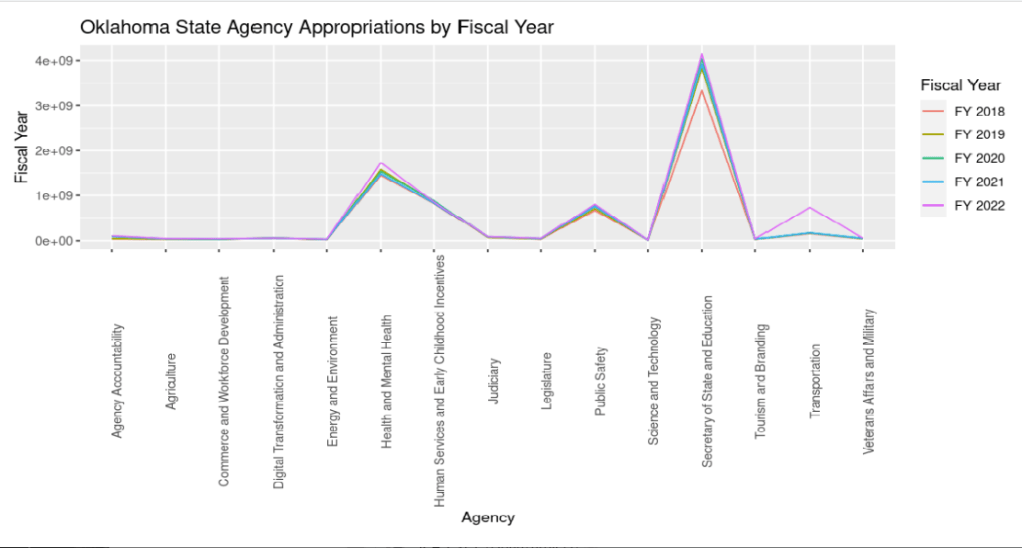
This graph is bad. It represents time change as the bin (the color of the lines), has the agencies on the X-axis, and is basically unreadable due to the scientific notation on the Y-axis. To go into more detail about why it is bad, I will explain how it violates my three rules in egregious ways.
First, it is not engaging. It is ugly and plain, and lacks the sleek and minimal vibe I go for in my current graphs. When I look at it, I am not interested in the story being told. Of course, aesthetics are subjective, but personally I would not be excited about reading more into this graph.
Second, it is far from intuitive. I have to sit and stare at the lines to figure out what they mean, and I made the graph! Its problems are numerous, but the worst part might be how I formatted the variables. It is a serious faux pas in data analysis to not put timeseries data on the X-axis, but for some reason I decided to break that rule. In defense of my former self, my data was wide-formatted and it would have been impossible to plot time on the bottom line in that format with the skills in data munging I had at the time. To correct this in the next graph I will show you, I simply melted and transposed the data frame to make it more readable by a computer. Check out the code here if you want to see how I did that.
Third, this graph is not simple. The line stylization implies that the values on the X-axis are linearly related which is not the case at all. This stylization mistake muddies the waters of the story that younger me was trying to tell and introduces noise that is totally unnecessary at best and misleading at worst. The appropriation values are also expressed in scientific notation which is very confusing for readers without advanced math knowledge.
When remastering this graph this week, I kept my three rules in mind. See the updated version below:

I think this graph is much better. First, it is engaging. The colors and clean design are appealing to the eye, and the clear labels make the story it is telling quite evident. Second, it is easy to read. Within a few seconds of looking at this graph, a reader can see that the state budget trends upwards (with a dip in 2021), and that education and health are the two biggest spending categories. Finally, it is simple. It isn’t as crowded as the last one and the labels on the Y-axis are expressed in dollars, making the story very clear.
If I was sold on doing a line graph – which I still think is a bad idea in this case – I would have done it like this, instead:
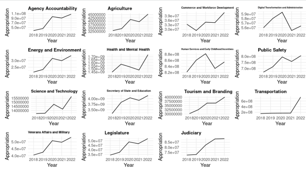
This graph is too crowded for my taste, but the lines are expressed as functions of time and scaled individually to show inter-agency variation in funding. One of the major flaws with my original graph was that the smaller appropriation values were drowned out by the larger values, making the whole graph harder to read.
Data storytelling is one of the most valuable skills us math nerds can have. We often like to talk in complex jargon and we care deeply about the nuances of our models, but most casual readers don’t want to read about that. What they want is an aesthetically appealing graph with a clear story; a graph that is informative from a brief glance.
This week, my call to action to you, dear reader, is to think about how you communicate your expertise. We’re all expert at something, so think about how you might express your advanced knowledge in your favorite topic to a complete beginner – you might even find that this exercise helps you better understand the topic, yourself.
I hope you enjoyed this week’s post. Don’t forget to subscribe and I’ll see you next Sunday!
- The Relationship between Democracy and Climate Change Policy
- The Obesity Epidemic Part 4: Incretin Mimetics and the End of Obesity
- The Obesity Epidemic Part 3: Obesity is a Class Issue
- The Obesity Epidemic Part 2: The Causes of the Crises
- The Obesity Epidemic Part 1: Obesity is a Public Health Crisis

Leave a comment