
Happy mothers day! I would like to take the introduction to this newsletter to thank all the moms out there. To my mom, you’ve raised two good kids and I’m grateful to have you as a role model – thank you so much for all that you do. To the other moms of the world, I speak for all of your sons when I say we are incredibly grateful for the sacrifices you have certainly made to get us all where we are. And to all the sons reading this – call your mom today, will ya? I know she would appreciate it. With that said, let’s get into some political data.
This week’s graphs are sourced from the 2020 ANES Timeseries Study. This first one shows how Democrats and Republicans feel about the two parties. The values on the Y-axis were generated by taking the average Republican and Democrat feelings thermometer scores for by party of respondent in each year data were collected. Check out how I did it here. See the graph below:

As shown in this graph, people generally feel warm toward their own party and cold toward the other. A notable takeaway is that, since data have been collected for these questions, the parties have only gotten more hostile to each other. To go a little more in depth with these data, I have plotted how Democrats, Independents, and Republicans feel about Democrats, and how Democrats, Independents, and Republicans feel about Republicans on two separate graphs. On these graphs, pay particular attention to the era from 2008 to 2020. See them below:
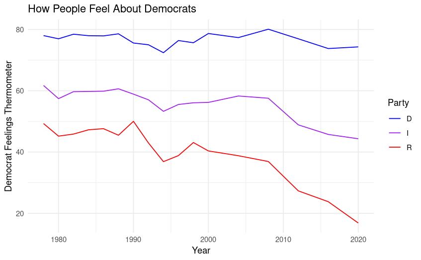

The most interesting things to me about these two graphs are 1.) the parties have grown substantially more hostile to each other since around 2008; and 2.) Independents are growing ever-more distrusting of the two major parties. This is not a shock considering the historically significant decline in presidential approval ratings since the early aughts.
Anyone who has even vaguely payed attention to politics in the last two decades could have probably guessed the results of this week’s analysis, but I still think understanding the data behind the assumptions we make is crucial to being well informed. If you take anything away from today’s post, dear reader, it should be that testing your assumptions with math is always a great idea.
Because today’s topic requires less interpretation than usual, I want to take the opportunity to further explain the “feelings thermometer” for the remainder of this newsletter. A feelings thermometer is a classic tool in survey methodology that asks respondents to rate their level of “warmth” towards a specific topic, person, group, or issue, with a range of 0 (coldest) to 100 (warmest). In survey research, these kinds of questions are meant to be posed in “value-neutral,” language, meaning the survey author works to have the question appear as non-controversial as possible. This is done to prevent the methodological error known as “priming,” or influencing people to answer a certain way based on the wording or order of the questions. A good feelings thermometer will show as little researcher-bias as possible, and will be designed to avoid activating any “priors” (preexisting opinions and assumptions) held by the respondents.
This level of care is put into every question on a respectable survey, but for (amature) social scientists like me, the feelings thermometer requires extra attention to get right. Because feelings thermometers result in discrete numerical data (discrete meaning the data can only take certain predetermined values), they are especially useful in statistical modeling. Statistical modeling describes the process by which math is used to make assumptions about the future based on data collected in the past. I discussed one form of statistical modeling last week (called linear regression), but there are many other ways of predicting the future based on previous observations.
It is so important to get feelings thermometers right because they require precision to be used in statistical modeling. A poorly-worded question can result in small changes in the answers from the respondents (as small as 5-10 points) and these small changes introduce unexplained variance into the statistical models used by social scientists, meaning that the predictive accuracy of the models are limited.
That does it for this week’s newsletter – thanks for reading and don’t forget to subscribe. I also want to mention that I upload the code used for my analyses in this newsletter to my professional portfolio – the nerds among you should check it out! Have a good one and happy mothers day; I’ll see you next week.

Leave a comment